How to Add and Edit Column Widgets in Wavity
Widgets in Wavity are interactive components or visual elements within a user interface (UI) that provide users with specific functionalities, data visualizations, or quick access to information and actions.
Widgets can be added/edited to interfaces/dashboards in Wavity platform. This features allows you to customize dashboards based on your requirements. For more details on creation of dashboards or interface, please refer the following link: How To Create Role-Based Interface/Dashboards/Layouts | Wavity
Existing dashboards can be edited or updated in the platform by the admin.
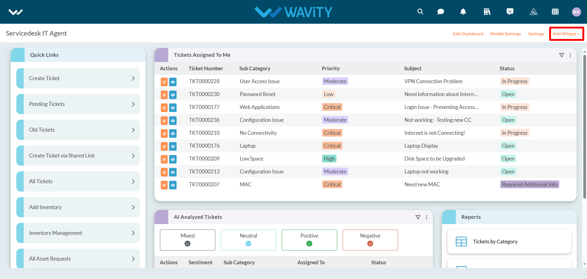
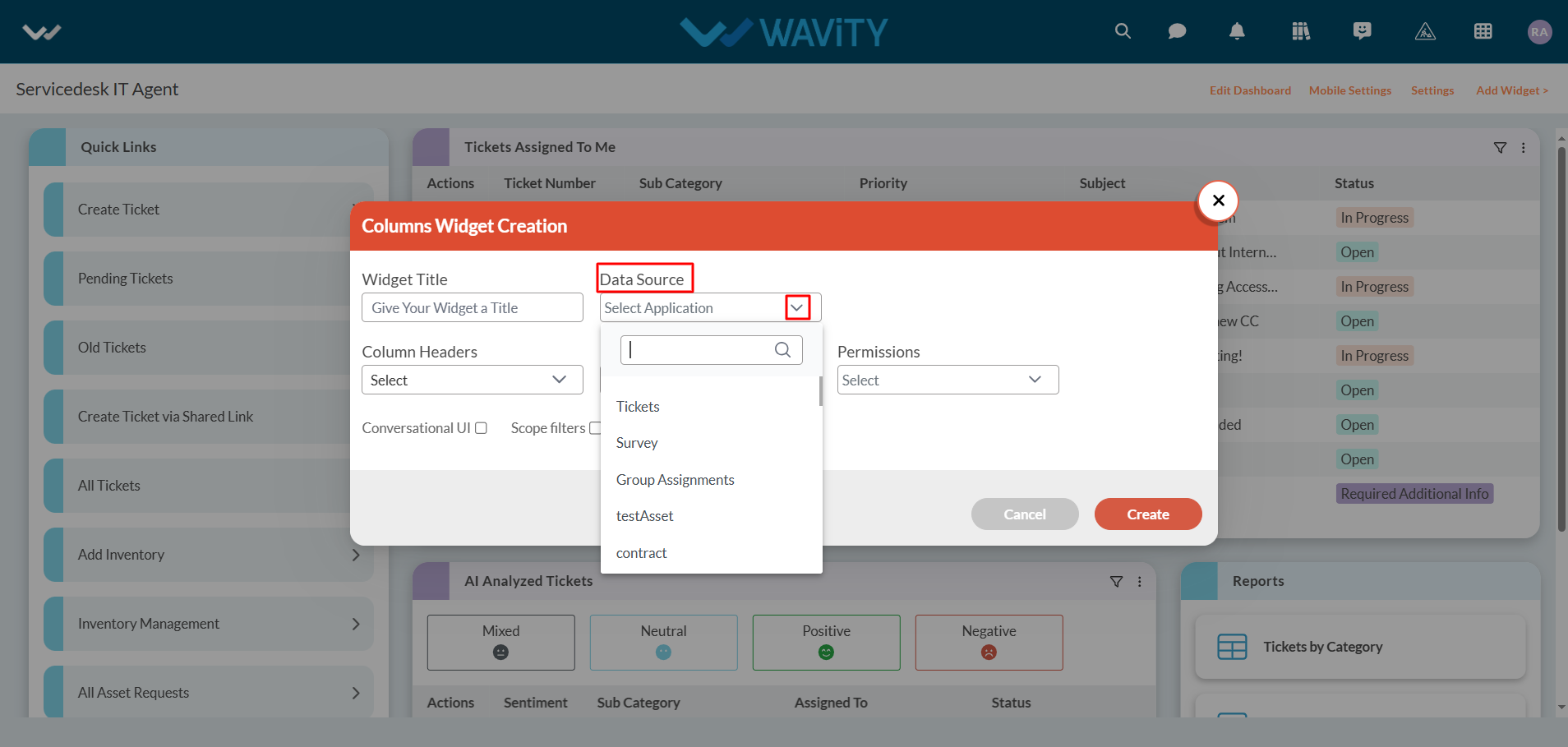
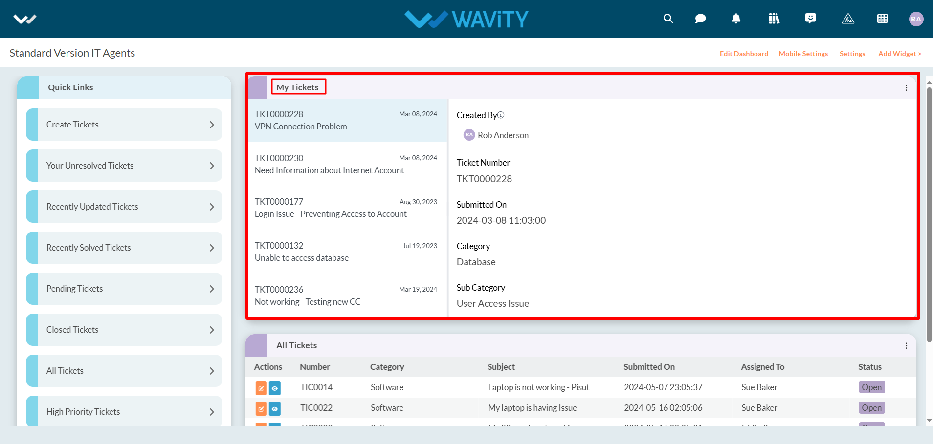
To add a column widget into your interface, Click on “Add Widget” as shown in below image.
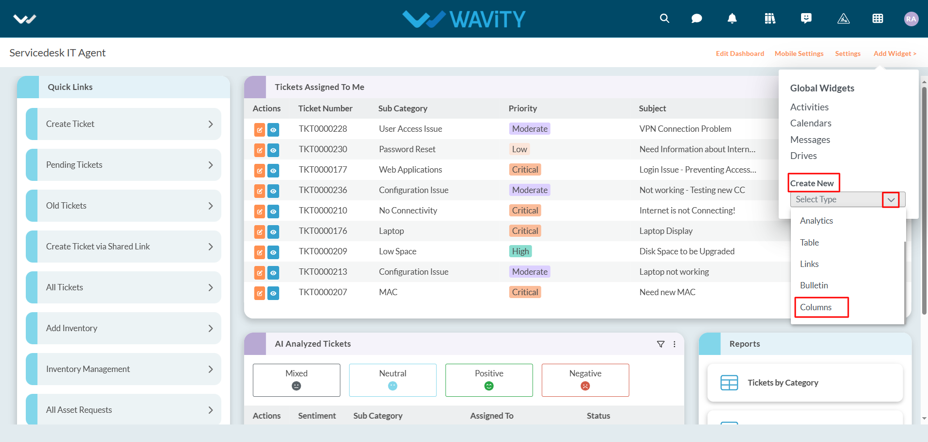
Click on “Columns" under create new section.
Provide the title of your new widget in the text box provided.
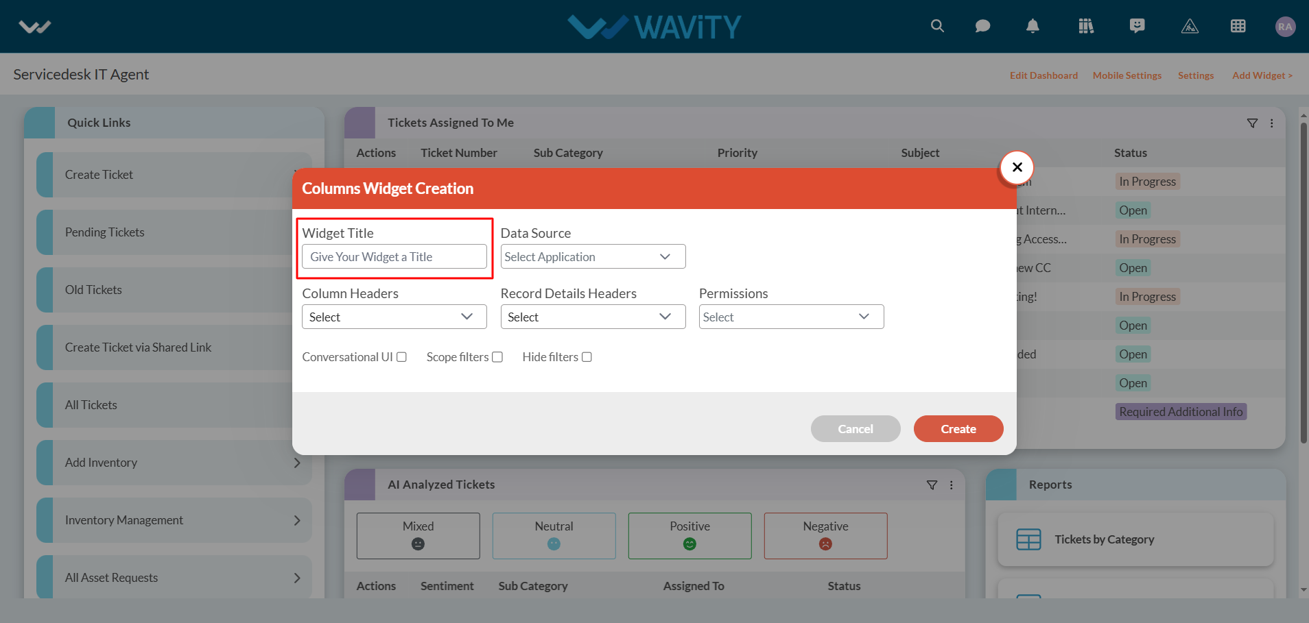
Select the “Form" or “APP” as the data source for which you are creating a column widget.
Under ‘Column headers’ section, Select a maximum of 2 headers. Unique Identifier’s such as “ticket number” or “request id” will be selected by default.
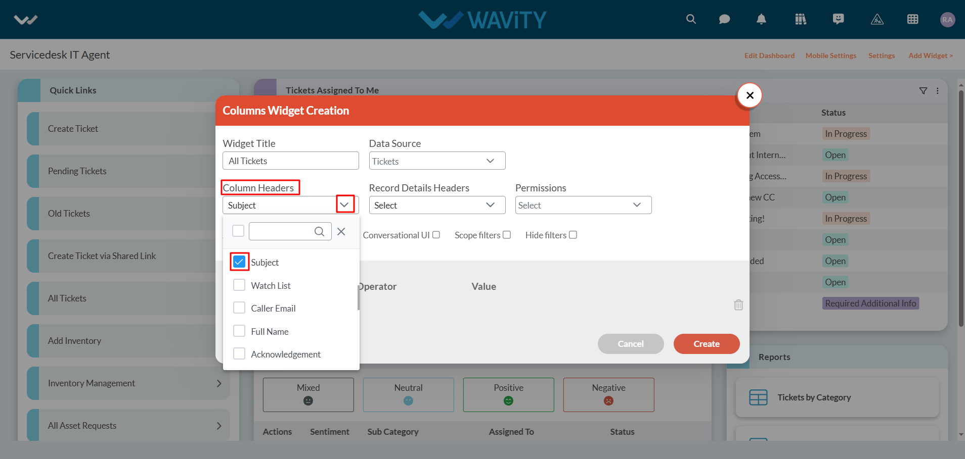
Under ‘Record headers’ section, Select any number of header as per your requirement. Preferably, Select the data headers which are a relevant part of the form.

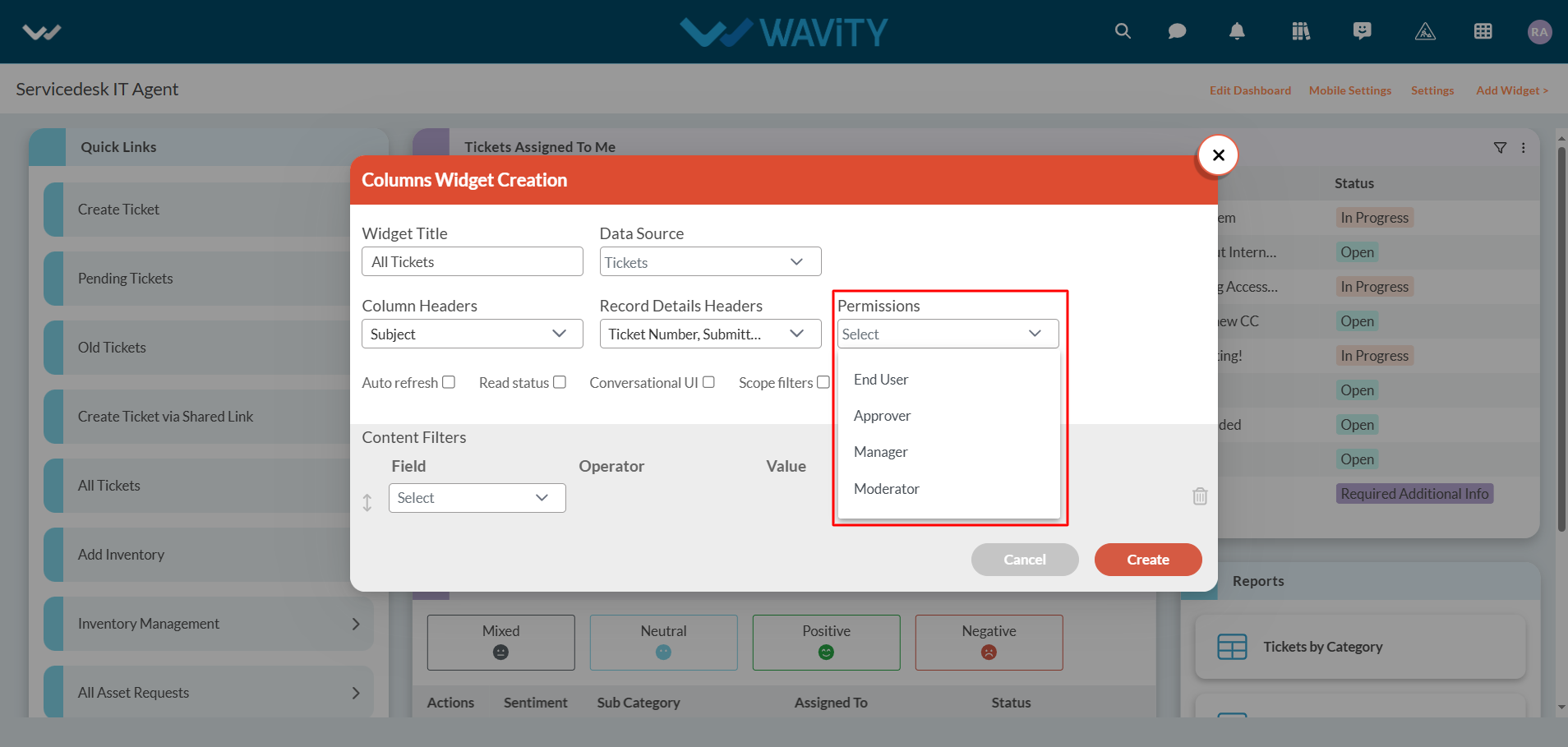
Under ‘Permissions’ section, select the user category for whom you would want to give access to view/edit the data.
You can enable or disable any of the features as listed below. Enabling “Conversational UI” is recommended for utilizing Column widget.
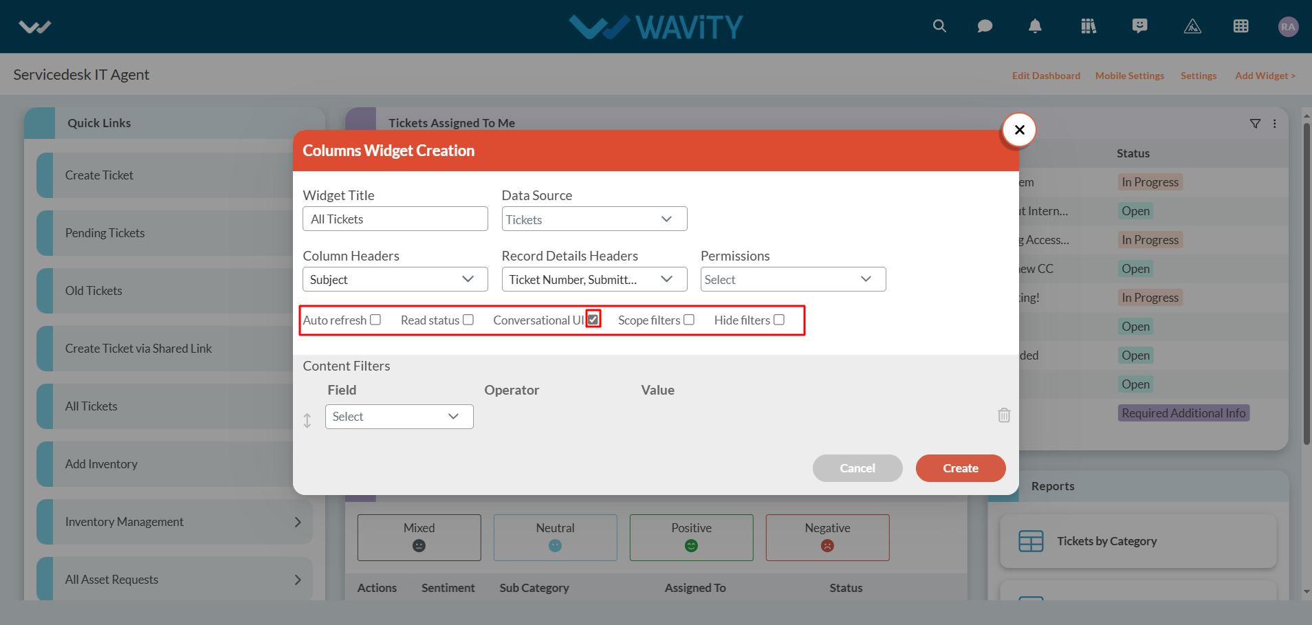
You can set “Content filters” as per your requirement. As a Final step, Click on “Create” button to add a new column widget into your interface.

Column Widget will be featured in the dashboard/interface as shown in below image. Click on the title of the column widget.
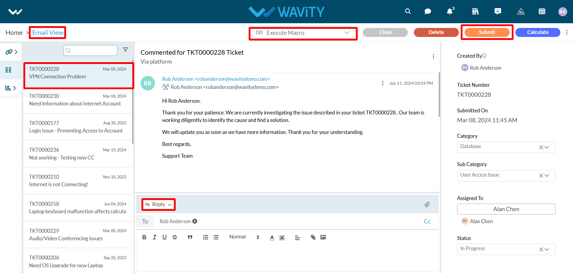
Column widget with conversational UI allows users to communicate seamlessly and also to execute macros (pre-defined responses).