Admin shall have access to create new applications in the platform.
App/Application: It is a digital form in Wavity platform.
Data Control: Each field in the App is called a Data Control. Such as Text field, Number field etc.
Sub Data Control: For designing purpose each Data Control is divided as Sub Data Control. E.g.: Text field is divided into Text block, Two fields, Three fields etc.
In the picture below (in red box) are the list of data controls which helps you to create and design an app.
Each of the data control has multiple sub-controls.
Before getting to know each of the data control in detail, for familiar feel you should get to know few of the prerequisites.
The Delete option shown in below picture deletes that particular data control.
The double arrow button in the below picture is used to move that particular data control up and down in the page.
If you click on the arrows in the below picture, you will find all the sub controls of that particular data control you have selected.
You can find the properties of each data sub-control in the right corner as shown in picture below.
Common properties for most of the data controls are as follows:
Required: If you checkbox this property, which means this field is mandatory.
Deprecated: If you checkbox this property, which means this field is ignored at the time of record creation/editing.
Help message: You can write a help message in this field, which helps user to create record with supported text accordingly.
Field Place Holder: If you want any data to be displayed, you can use this property. E.g. Enter your name.
Read Only: If you checkbox this property, which means you cannot enter any details in this field at record creation/edit time.
Hide: If you checkbox this property, which means you can hide the data the user has entered in that particular field
Allow to import data: If you checkbox this property, which means you can import data using Excel into this field.
One Time Entry: If you checkbox this property, which means you can allow the user to enter the data only once. If the user wants to change the data after s(he) saves the record, the system does not allow them.
Script: If you checkbox this property, data will record in that field as per the condition specified in the script. This property is used mainly for UI validations. Click on the Validate button After writing the script, it will validate the written script if it is error free.
On Change: when this option is checked then the script will execute when user edit the data for the particular data control in record create and record edit page.
On Save: When this option is checked then the script will execute when user save the record or click on “Save” button.
On Open: When this option is checked then the script will execute when user open a record create page or open an existing record.
Control List: Click on this option, it will show all the Data controls IDs which you can use in the script to transfer the data or validate the data.
Category Control
There are seven types of sub-data controls for this category. Each of them are described below with their properties.
Other properties that include for most of category Sub-data controls are:
Selection Type: Here you can select Single or Multiple values in the dropdown.
Default: You can also assign default value for the field if nothing is selected.
Allow “other” option while record entry: You can check box this option if users wanted to enter option other than the one given in dropdown list.
Data export type: You can select either value or display name to appear in the drop down.
You can click on Add option button to add more value/display names.
Dropdown: This sub-data control is used when you want values to be displayed in dropdown format.
Linear: This sub-data control is used when you want values to be displayed in line format.
Toggle: This sub-data control is used when you want to record data in on/off or yes/no format.
Segment: This sub-data control is used when you want values to be displayed in line format.
Reference: This sub-data control is used when you want values to be displayed from another or same application. Here you can select the application on the basis of want values you want and what values to be displayed in options. You can add filters to get records by specific user/time.
Dependent: This sub-data control is used when you want values to be displayed from another or same application based on a match in both the selected applications. You can also add filters to get records by specific user/time.
Dependent multi values: This sub-data control is used when you want values from another or same application based on a match in the application selected. Here you can select single or multiple values. These selected values will be displayed only in record detail and at edit time.
Text Control
There are six types of sub-data controls for this category. Each of them are described below with their properties.
The properties that are common for Text Sub-data controls are:
Input field type: The text input field type can be None, Alphabet, Alphanumeric, Url, Email, and custom format.
If you select custom format as input field type, then you have to Specify the format with the help icon beside it.
Max length: Maximum length that you can enter in the text field.
Plain: This sub-data control is used when you want text to be displayed in plain format. There are different Input Field Types to use. They are Alphabet, Alphanumeric, Email, Url, Phone Number, Custom Format (Eg: Can be used for Bank Account No.), QR Code and Bar Code to scan from Mobile app and input the code into platform.
Text Block : This sub-data control is used when you want text to be displayed in block format .
Other properties that include for this Sub-data control are:
Editor: This property rich and plain text options. Rich text option allows the user to modify the color, font, size of text etc. In Rich Test option, User can attach links, pictures, videos in Text Box. Where as plain text option is just the text that we typed and no editing is possible.
Label: This sub-data control is used when you want labels in your app.
Two Fields: This sub-data control is used when you want text to be entered in two fields.
This is similar to plain text with two different fields in it.
Three Fields: This sub-data control is used when you want text to be entered in three fields.
This is similar to plain text with three different fields in it.
Auto Id: This sub-data control is used when you want to generate auto ID for a record in your app.
Other properties that include for this Sub-data control are:
Prefix: You can set Prefix for auto generated ID using this property.
System date as prefix: You can checkbox this property, if you want system date as prefix.
Prefix separator: You have different options such as Underscore, Hyphen, Number sign, Colon, Group to separate ID from prefix.
Suffix: You can set Suffix for auto generated ID using this property.
System date as suffix: You can checkbox this property, if you want system date as suffix.
Suffix separator: You have different options such as Underscore, Hyphen, Number sign, Colon, Group to separate ID from suffix.
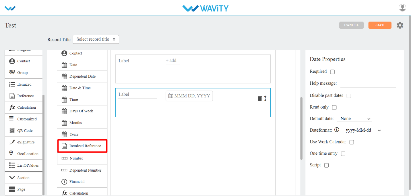
Date Control
There are eleven types of sub-data controls for this category. Each of them is described below with their properties.
The properties that are common for Date Sub-data controls are:
Disable past dates/time: Past dates/time cannot be used if you checkbox this property.
Default date: It is of two types.
System Date: If you select it, you will get system date by default.
Custom Date: If you select it, you will get to select a date from calendar.
Date Format: You can select different date formats that we support as and when required. Eg: MM-DD-YYYY, DD-MM-YYYY, DD/MM/YYYY and so on.
Time Format: You can select either AM/PM or 24hrs format.
Date: This sub-data control is used when you want date field in your app.
Date Dependent: This sub-data control is used when you want to use date from same or another application. You can also apply filters here.
Date Range: This sub-data control is used when you want to select date range in your app.
Date and time: This sub-data control is used when you want date and time in your app.
Date and time Range: This sub-data control is used when you want to select date and time range in your app.
Days Of Week: This sub-data control is used when you want to select days of week in your app. Display property type can be inline/dropdown. Selection property type can be single /multiple.
Months : This sub-data control is used when you want to select months in your app. Display property type can be inline/dropdown. Selection property type can be single /multiple.
Years: This sub-data control is used when you want to select years in your app. You can define start and end of the year value. Selection property type can be single /multiple.
Time: This sub-data control is used when you want time field in your app.
Time Range: This sub-data control is used when you want to select time range in your app.
Time Interval: This sub-data control is used when you want to set time interval in your app. You can select unit value such as Minute, Hour, Day, Week, Month and Year. You can also define minimum and maximum selection.
Attachment Control
There are three types of sub-data controls for this category. Each of them are described below with their properties.
The properties that are common for most of the attachments Sub-data controls are:
Allowed Extensions: You can select any extensions for the attachments in the dropdown provided.
Max file size: You can set maximum upload file size limit.
Max no. of files: You can set limit for maximum no. of files for upload.
Attachments: This sub-data control is used when you want attachments field in your app. Here while uploading you can allow the user to upload the attachments into their drives.
Image: This sub-data control is used when you want images field in your app . You can also checkbox Only selfie option, if you want only selfie image.
Tag: This sub-data control is used when you want tags in your app. You can set maximum no of tags by selecting a number from Max no. of tags option.
Numbers Control
There are three types of sub-data controls for this category. Each of them is described below with their properties.
The properties that are common for most of the numbers Sub-data controls are:
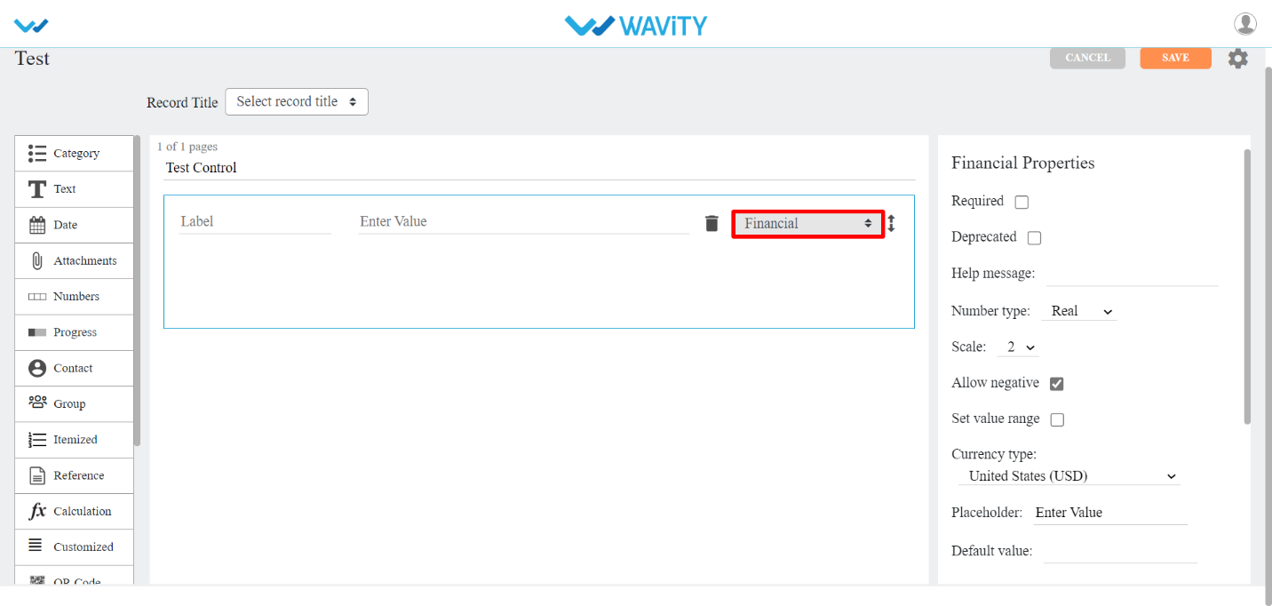
Number type: You can select Real or Integer number from dropdown.
Placeholder: Instead of Enter Value, you can enter any other text in its place.
Scale: You can set no. of decimal places using this property dropdown.
Allow negative: You can allow using negative numbers by check boxing this property.
Set value range: You can select a range of values using this property.
Default value: You can set default value at record entry time by using this property.
Number: This sub-data control is used when you want numbers field in your app .
Dependent Number : This sub-data control is used when you want numbers from same or another application. You can also add match filters from the application selected.
Financial: This sub-data control is used when you want financial field in your app . You can select currency from dropdown in Currency type property.
Progress Control
There are two types of sub-data controls for this category. Each of them are described below with their properties.
The properties that are common for most of the progress Sub-data controls are:
Number type: You can select Real or Integer number from dropdown.
Progress type: You can select percentage or value by using this property.
Step value: You can select each step value using this property from dropdown provided.
Single Slider: If you wanted to use sliding for numbers, You can use this sub-data control.
Slider Range: If you wanted to use sliding for number range, You can use this sub-data control. You can also use Default start value and Default end value options for selecting number range.
Contact Control
Contacts: This data control is used when you want to add contacts from the users/groups in this tenant.
The common properties for this data control are:
Auto select by the system: If you checkbox this property, system will select the user/group from this tenant or you can select any user/group from the dropdown provided.
Show user details: In this property, you can select a user details such as Manager, Phone, Email, Locality, Street address, Region, Postal code, Country to show in the app.
System user: If you checkbox this property, login user will be the system user and you don’t have to select any other user for contact.
Selection type: You can select Single or Multiple users in contact. Also you can set minimum to maximum number of users by using this property.
Restrict by Spaces: You can restrict to display specific groups in contact field by using this property.
Default user: By using this property you can set default user for the contact field in the app.
Dependent Contacts: This sub-data control is used when you want contacts from same or another application. You can also add match filters from the application selected.
Reference Control
Reference: This data control is used when you want to refer data from one application to another.
Calculation Data Control
Calculation: This data control is used when you want any calculations to be done in your app. To know how this data control is used, You can make use of help (?) icon in the data control.
The properties for this data control are:
Scale: You can set no. of decimal places using this property dropdown.
Allow override: If you want to edit the calculated value then you can checkbox this property.
Enable Scripting: You can enable the scripting part in Calculation data control with the help of this property. You can use Plain, Category DropDown, Category Linear, Category Reference, Category Dependent, Days of Week, Month, and Year data controls in the Calculation data control with the help of this property and you can write a script and return some numerical values.
F(x): It has math functions.
(x): It has time functions.
3rd Icon (Red circled): It has all the data controls (related to Number and Date) from current app.
4th Icon (Red circled): it has all the apps with data controls from the current tenant.
QR Code Control:
QR CODE: This data control is used to auto generate QR Code for each of the record created.
eSignature Control
eSignature: This data control is used when you want eSignature for each of the record created.
Geolocation Control
Geo Coordinate: This data control is used when you want Latitude and Longitude positions to be entered in the record.
List of Values (LOV) Control
ListOfValues: This data control is used when you want to list few or all the values from another application based up on certain match if required.
Section Control:
This data control allows grouping of fields and optionally it can be restricted based on roles.
There are four types of sub-data controls for this category. Each of them is described below with their properties.
The properties that are common for most of the Section Sub-data controls are:
Color: You can select the color of the section using this property.
Show to all: If you checkbox this property, every user can view Approver section.
Enable sequential flow: If you checkbox this property, each approver will approve the record as per their given sequence number.
Flow index: Record approving sequence number is given using this property.
Section Approver(s): With this property, you can select the user/group to approve the record.
End User: This Sub-data control is used when when you want to give access to specific user/group to edit the record in that particular End User section.
Moderator: This Sub-data control is used when you want to give access to specific user/group to edit the record in that particular Moderator section.
Approver section: This Sub-data control is used when you want to give access to specific user/group to approve the record in that particular Approver section.
Page Control
This data control is used when you want your app to look neat in the form of pages. It allows grouping fields in a page format.
Itemized Control
This data control is used when you want other information in rows and columns for each record. Refer the pictures below for clear understanding.
You can drag and drop the values from left to right as shown below.
It will be displayed in the following format after the saving the application.
All the Itemized data controls are same as the data controls explained from start. Itemized Reference is the additional data control that got added in Itemized data control.
Itemized Reference: This sub data control is used when you want to refer any data control in that particular application. Min selection and Max selection are the properties used to allow the field to restrict rows in it.
Final Summary: Calculation summary of all the rows in each record can be shown using this sub-data control.
Additional Summary: If you want any other calculation summary other than Final Summary, Then you can use this sub-data control.
Customized Control:
This data control is used when you want other information in multiple rows for each record. There are no sub-controls related to calculation. You can also make use of this control as Itemized by check boxing Grid View in properties.